Hamilton Mill United Methodist Church
Hamilton Mill United Methodist Church (HMUMC) is a church located in Dacula, GA. I was contracted to work on this project as a part of a local/remote and cross-disciplined team through The Mobile Vine. Team members had expertise in the areas of branding, social media, app/web development and marketing. My role was as a Senior Visual Designer and I participated in brainstorming sessions; user flows; site mapping; wire framing and visual design of the website.
User Flow
The team and I identified four user personas:
- New–people that just moved to the area and were looking for a new place to worship and people already in the area looking for a new place of worship.
- Children–really this was the parent of children looking for a place of worship that had ministries focused on children. HMUMC also has an award winning preschool, so some users may be looking for a good preschool.
- Youth–HMUMC has a very active youth group and associated ministries. HMUMC was looking to attract more youth encompassing the teen to college age groups.
- Adult–HMUMC has a plethora of small group ministries that cover almost any subject/category imaginable. If a user was looking for a place of worship where they could really get involved in the church, HMUMC was that place.
We worked with the team at HMUMC to figure out the best way to showcase these attributes and guide a user to the appropriate areas of interest.
Sitemap
The sitemap had a couple of iterations before receiving client approval. However, after I started designing the design mock-ups, it was decided we needed to have another meeting with the HMUMC team and rework the site’s page architecture.
The second iteration of the sitemap was done with more visuals to help illustrate what we were proposing to the HMUMC team.
Design Mock-ups
I started creating design mock-ups from the first iteration of the wireframes, but midway through and with further consultation with the team, it was decided we needed to rethink our sitemap to better distribute the content.
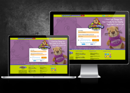
The final design mock-ups used a landing page approach for each user persona with large button graphics. Because the header space needed to house a lot of information and menu links, I kept the hero slider area height slim to keep more info above the fold.
See what the site looks like today: hmumc.org